New Revenue Acquisitions from CHICAGOPEX
I finally finished imaging the goodies I picked up at or about the same time as CHICAGOPEX. The vast majority of my acquisitions came from Mike Morrissey’s exhibit and collection of 2nd issue (R103-R133) and 3rd issue (R134-R151) revenue stamps.
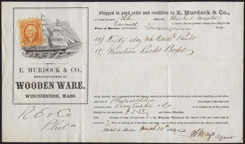
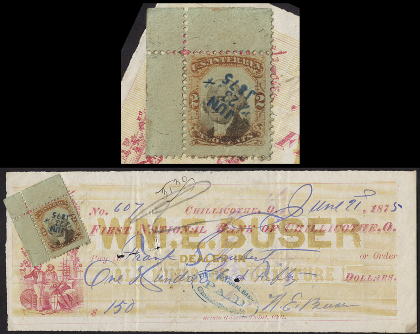
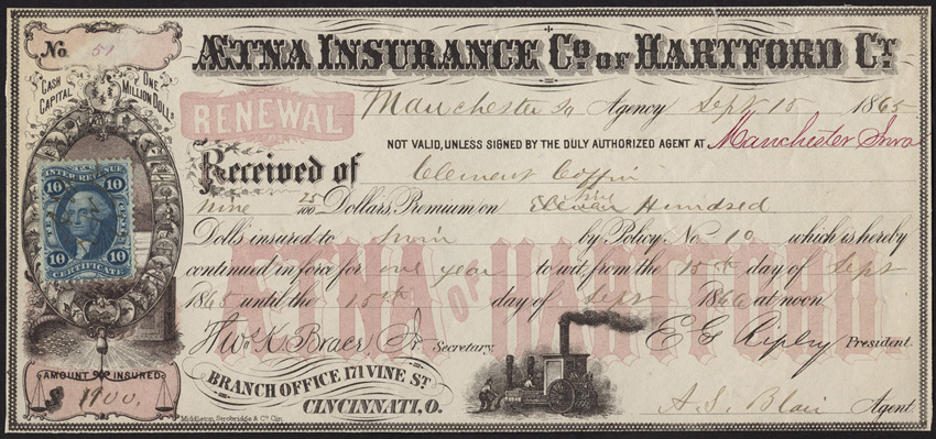
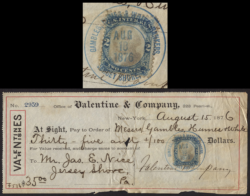
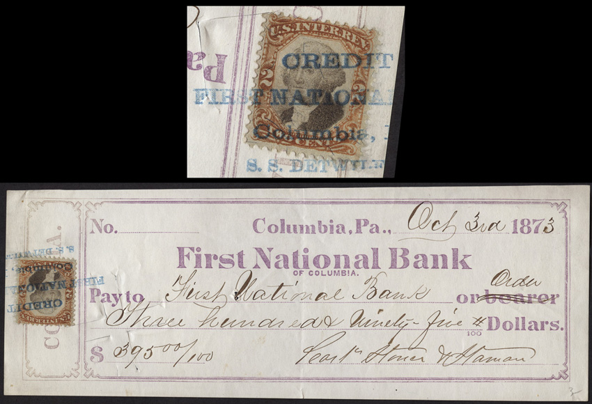
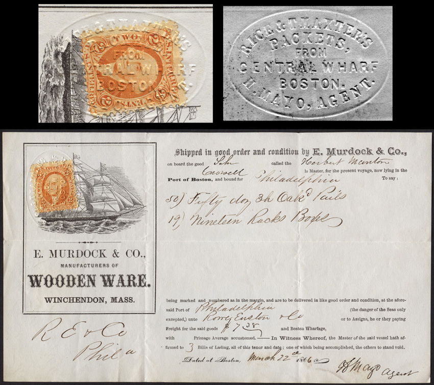
Let’s start off with some documents, the majority chosen for their cancels, with the exception of the Aetna document, which was chosen for the aesthetics of the document itself.

Now on to the stamps…
First, a lovely R106 with great margins.
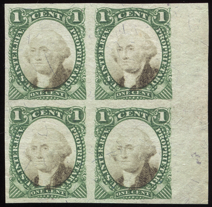
A great margin block of RB1c.
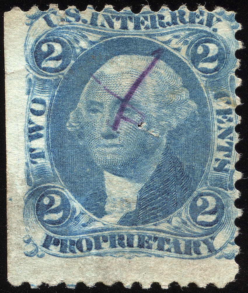
A printing anomaly that I’ve dubbed “Frightened George”. His hair is literally standing on end!
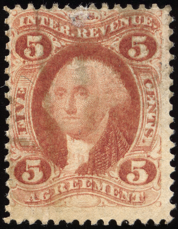
A no-questions genuine R3b exhibiting your typical (horrible) part perf left-right centering.
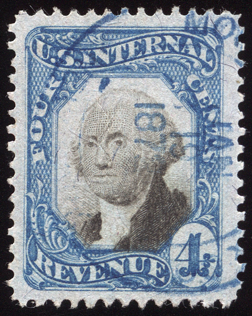
Lurking under this handstamp cancel is the scarcer R13e (ultramine) version of R13.
Now to the cancels…
And lastly, the pieces I’m most thrilled with…
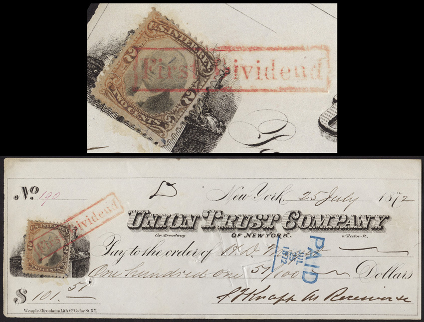
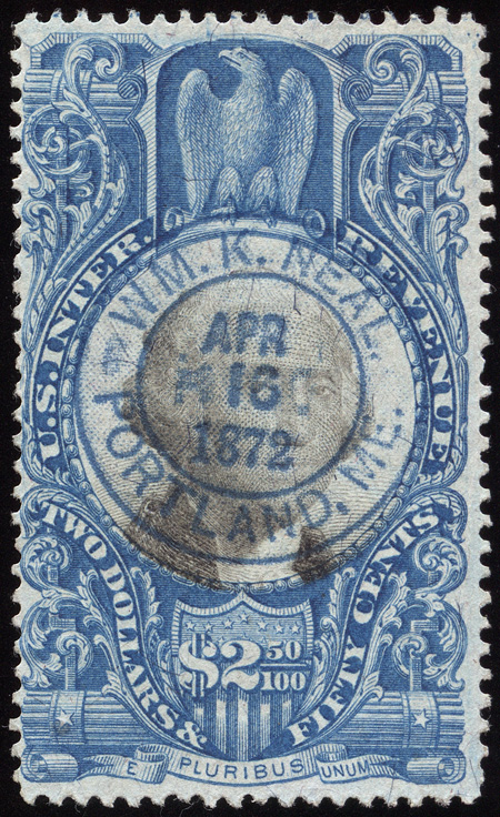
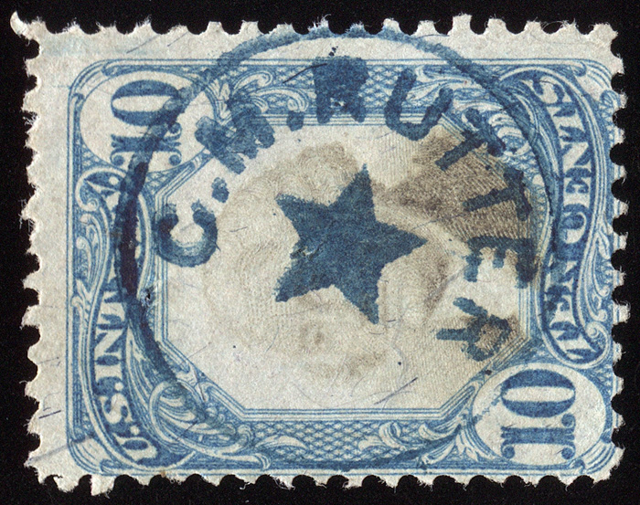
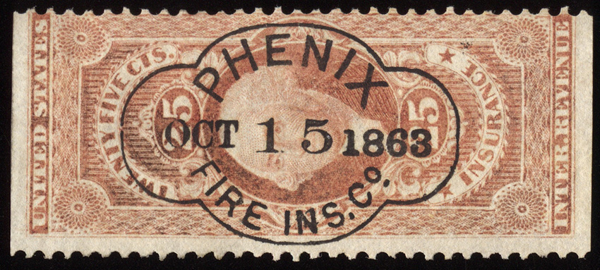
The finest strike of this cancel I’ve ever seen, obtained in a trade with Bart.
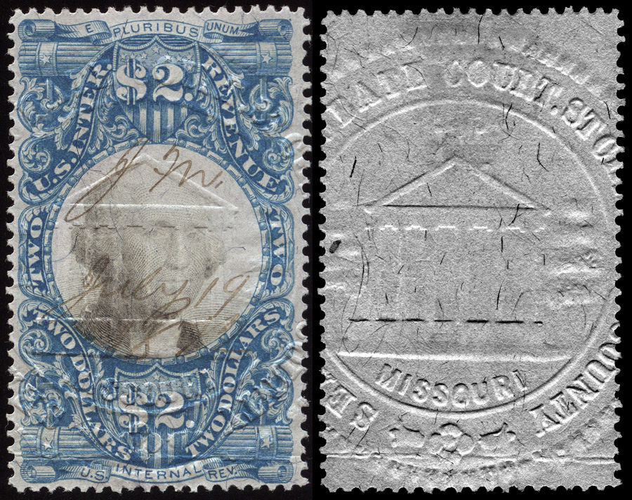
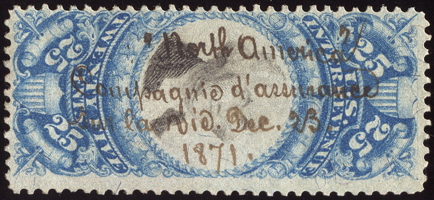
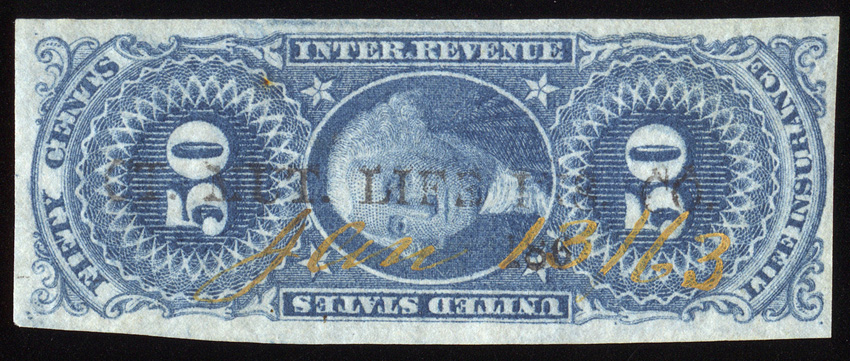
An unusual manuscript cancel from the North America Life Insurance Co., written in French. Life insurance policies were far less common than they are today, reserved for the very wealthy, hence life insurance documents and cancels are very uncommon.
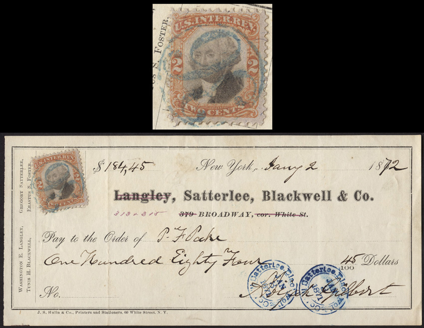
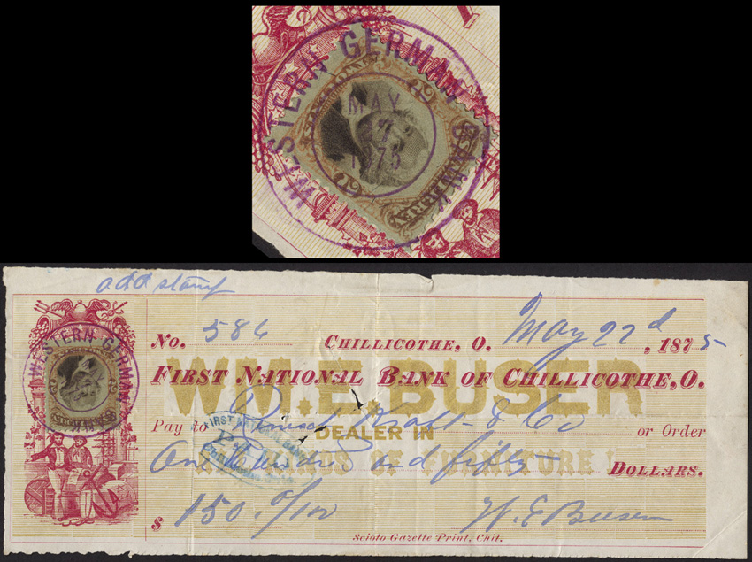
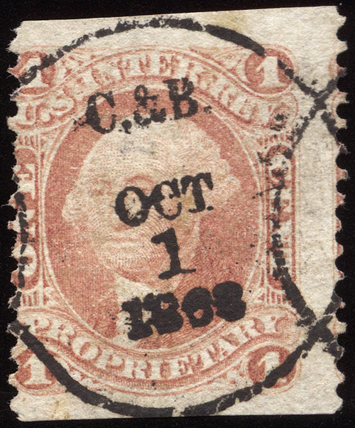
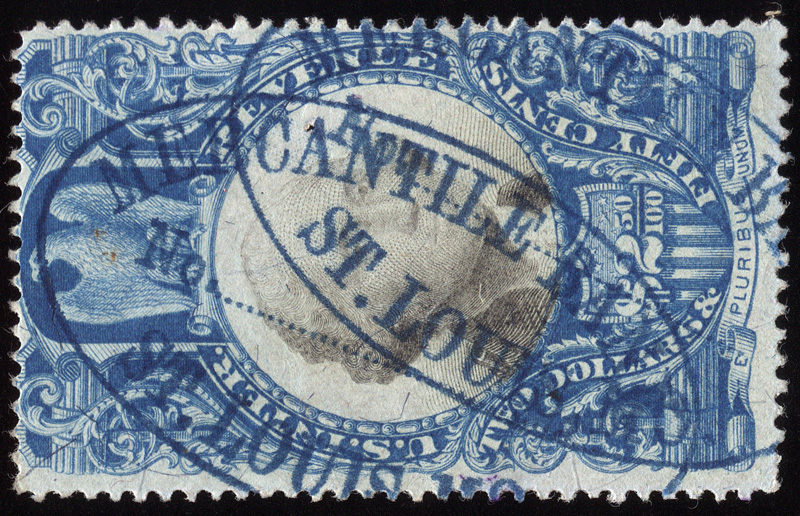
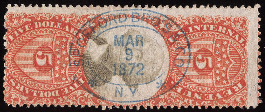
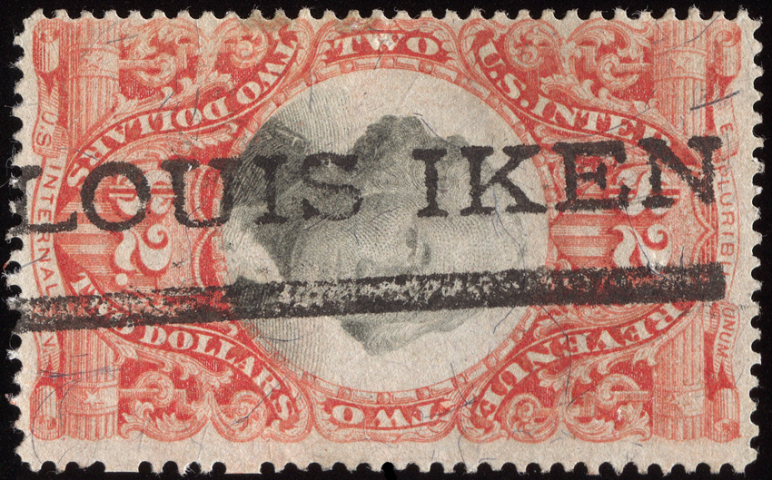
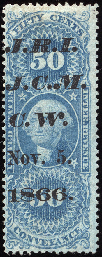
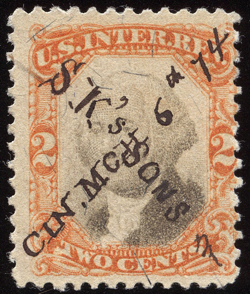
A great printed cancel with use of fancy typefaces. I saw a number of these with different years and initials at the top. Richard speculated that these were for bond coupons, and the initials were the different bondholders.
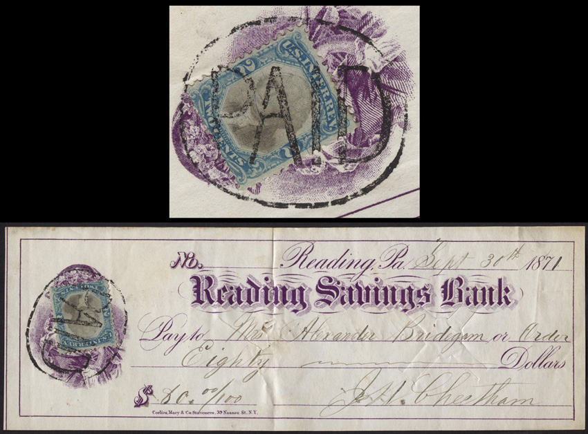
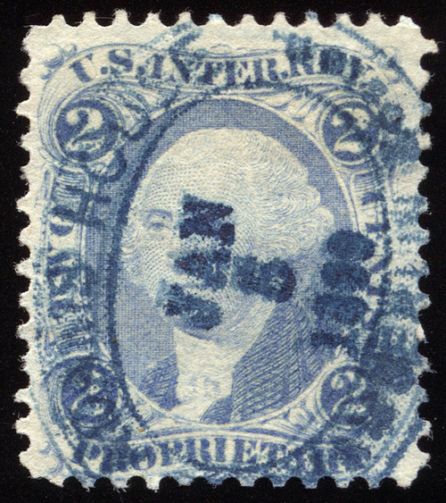
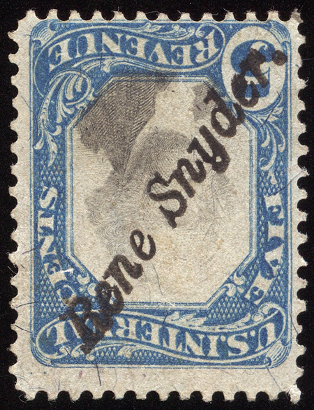
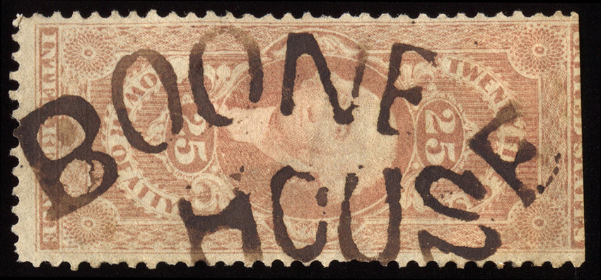
One of the weirdest cancels I’ve ever seen…
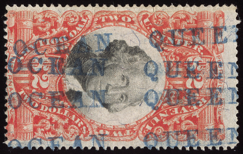
A petit “fancy” manuscript cancel written as crossed lines of text.
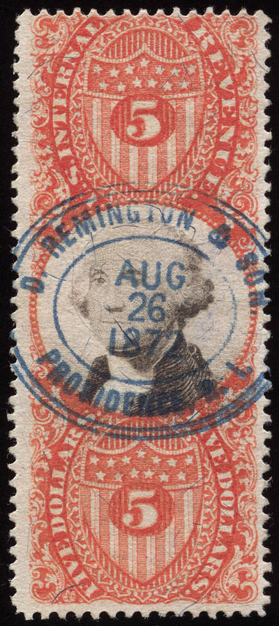
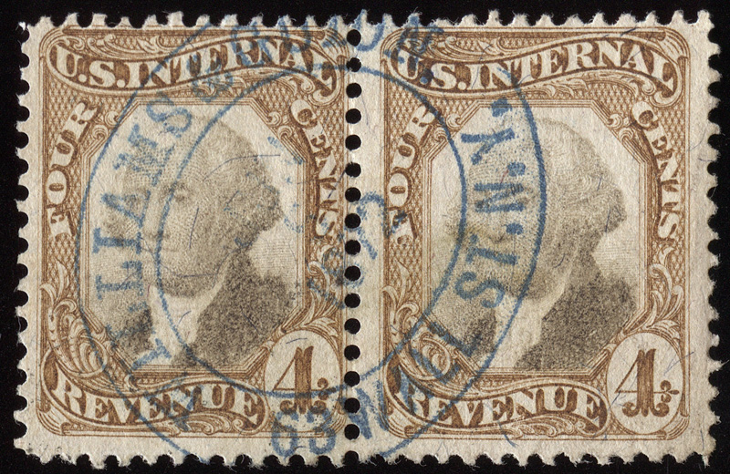
A nice pair of R136 with SON cancel. Interestingly enough, according to the Curtis Census, pairs are the largest reported multiples of this stamp… no blocks or strips.
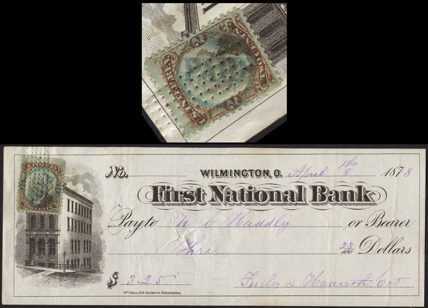
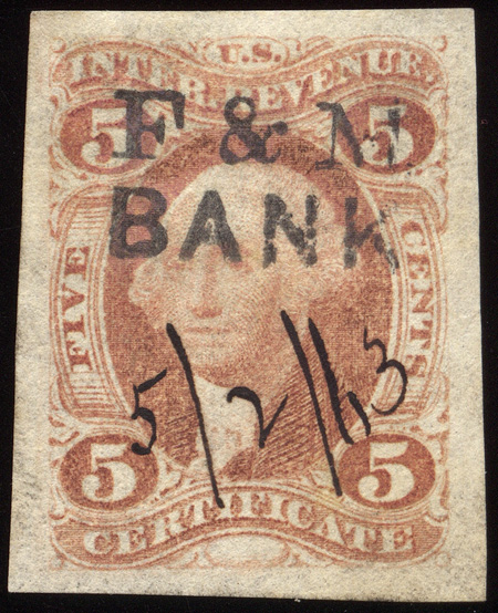
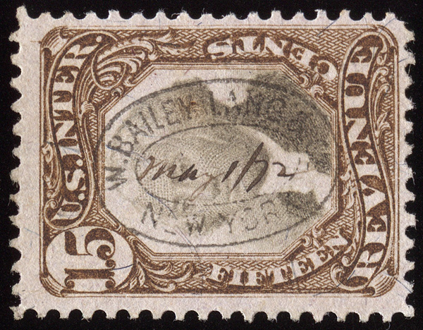
While the Connecticut Mutual Life Ins. Co. straight line cancel is not particularly scarce, this is the first example I’ve seen where the manuscript portion was done in gilt ink. Gold ink cancels are very scarce.
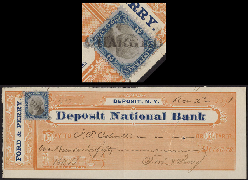
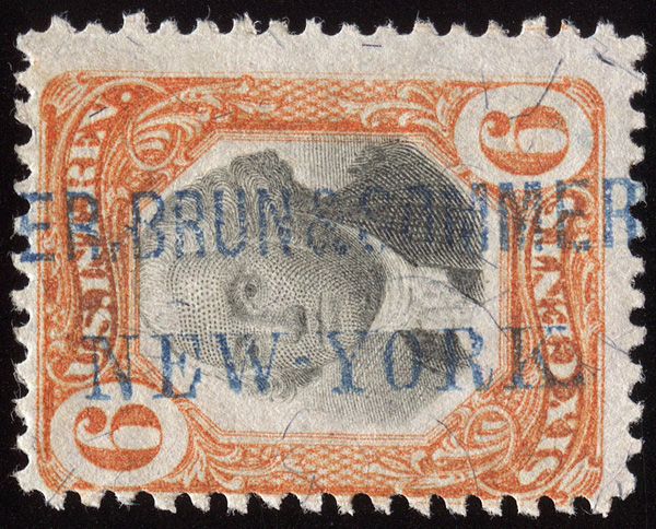
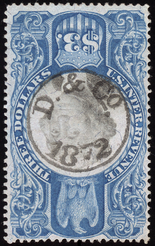
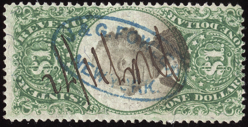
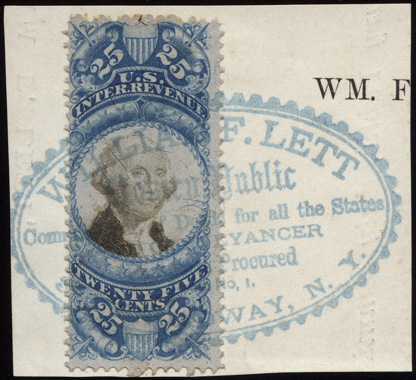
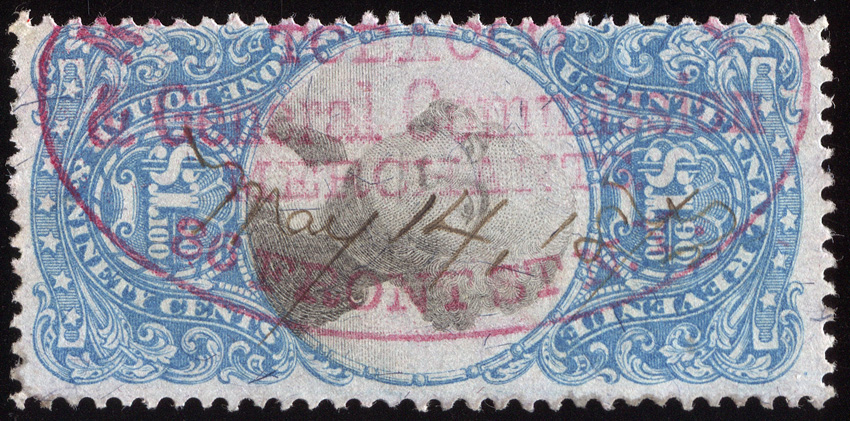
The “oddball” 2nd issues ($1.30, $1.60, $1.90) are rarely found with aesthetically pleasing handstamp cancels, so when I saw this one, I had to pick it up. The business itself is unattributed at this point; I couldn’t find online the business that occupied 86 Front St. in 1872.
A somewhat beat up but crazy all-over double transfer on R13c. Almost all elements of the design, including the portrait, are doubled, but since they are in different directions it cannot be a double impression. This one is slightly different from the other all-over DT I have.
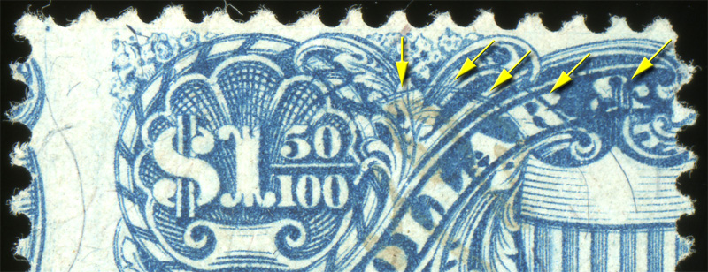
The vast majority of examples of the R120 foreign entry I have seen have poor-left-right centering, including the one I own. In the Morrissey collection there were 2 examples to choose from, one on document which would have been cool, or this one, which has impeccable centering. Given what I have seen to be the norm on this variety, I opted to upgrade based on condition.
First, here is an image showing the diagnostic points of the foreign entry, the vertical lines through the ampersand being the easiest to spot at a glance.

R115a is one where the Scott catalog value is WAAAAAAAAAAAY off the mark. Scott lists the sewing machine perf of R115 at $75, with the much more common sewing machine perf of R112 at $125. This is only the second 50-center I have seen, and I own 6-8 examples of the 25-center. You don’t just see them. Realistically, this stamp should probably catalog in the $400-500 range.
This one is additionally nice in that it has large margins all around and 2 nice handstamp cancel strikes.

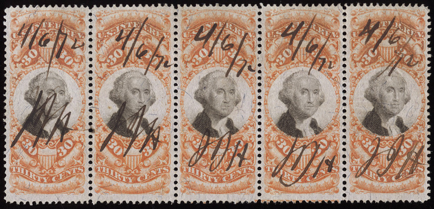
And finally, a piece that’s a bit out of the norm for me. I don’t chase multiples or play the “this is the 7th largest known multiple” game. I know a lot of people who do go out of their way to collect multiples, and many dealers attach premiums for the Nth largest known according to the Curtis Census, etc.
This strip of R140 appealed to me though. It’s the 3rd largest reported multiple, with a block of 6 and strip of 6 being larger. However, this strip of is of infinitely better quality than either of those. All 5 stamps have perforations well clear of the design, the strip is perfectly sound, and if you look at the lower right, it has a hint of a margin imprint capture.
This is one where the aesthetics won me over.